Marketing Operations
GoDaddy
2021
Figma
Sitecore
Jira
Split.io
Sitecore
Jira
Split.io
HTML/CSS
JavaScript
React
JavaScript
React
As a Marketing Operations Technologist II, I was responsible for the US homepage of godaddy.com as well as the Hosting products internationally. My team included visual designers, front-end engineers, and copywriters.
While a recent rebrand, GoDaddy’s design system was due for an overhaul. A new direction for the company meant the visual designers had room to play with modernizing website, and I was the go-between for visual and engineering.
While a recent rebrand, GoDaddy’s design system was due for an overhaul. A new direction for the company meant the visual designers had room to play with modernizing website, and I was the go-between for visual and engineering.
Marquee Notifcations
Logged-in users only reach the home page on login from the home page, meaning they didn’t visit from one of their notification emails and did not click the menu notification badge.
I created a concept for notifications in the right 25% of the home page marquee — this had success in production for recapturing expiring subscriptions and abandoned carts.
GoDaddy Guides
A refresh of the customer support area of the site focused on humanizing our specialists.
I worked on the Help component that was sprinkled throughout the site to encourage customers to reach out when they were stuck, whether through a phone call or Help Article search.
Hosting Checkout Flow
As part of simplifying the checkout for our most complicated products, such as VPS Hosting, I dug into the Sitecore backend to explore options for working with large numbers of configuration variations.
Condensing the multi-step process to a single screen where all config options could be seen at the same time, we managed to reduce the cart abandonment rate by 12% for Hosting pages as well as seeing improvements in Domains and Productivity sales.
WDS Onboarding
My former department in Website Design Services was looking to optimize their client intake process, including on the godaddy.com front-end purchase flow..
My team’s exploration of the Design Consultation Tool led to a redesign which greatly reduced the number of revisions in website builds, from an average of 6 revisions before publish to around 3.
Website Design Services
GoDaddy
2021
WordPress
WooCommerce
Jira
WooCommerce
Jira
HTML/CSS
jQuery
PHP
jQuery
PHP
During the Covid-19 pandemic, I joined GoDaddy's Website Design Services in my first corporate role. Due to lockdown orders, thousands of small businesses had to suddenly pivot to ecommerce with no experience in the internet space. Hundreds of individuals and entrepreneurs relied on me to create their new digital storefronts.
GoDaddy WDS provides a complete website with design, copywriting, development, and ongoing troubleshooting in under a month. I was responsible for creating the back-end setup using WordPress and WooCommerce and designing the front end with Beaver Builder and a small suite of approved plugins. Most clients did not have branding, so assets were sourced from Google Fonts and Unsplash.
GoDaddy WDS provides a complete website with design, copywriting, development, and ongoing troubleshooting in under a month. I was responsible for creating the back-end setup using WordPress and WooCommerce and designing the front end with Beaver Builder and a small suite of approved plugins. Most clients did not have branding, so assets were sourced from Google Fonts and Unsplash.


ThinQ.tv
Startup
2019
2019
Figma
GitHub
Ruby on Rails
GitHub
Ruby on Rails
HTML/CSS
JavaScript
Embedded Ruby
JavaScript
Embedded Ruby
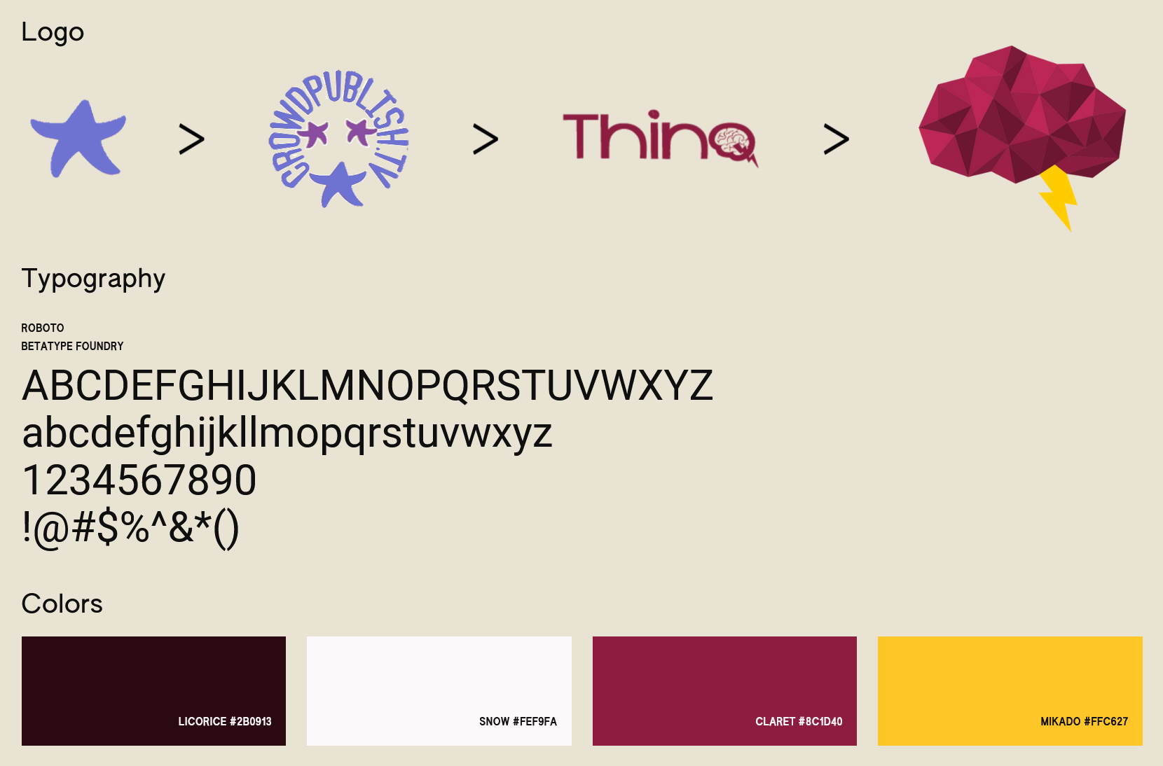
In my senior year at ASU, I volunteered at CrowdPublish.tv, an ASU Venture Devils︎︎︎ startup that looked to connect authors, directors, and other creatives to livestream discussions and sell exclusive perks and crowdfund new content.
My role at this startup — later known as ThinQ.tv — was to improve the user experience. While originally brought on for user interface design, after thorough vetting of the codebase I became involved in holistically designing the product.
I revamped the project files for consistent and accessible styling, defined the user flow, integrated livestreaming and payment processing features, and started work on updating the UI and branding.
View Project on GitHub︎︎︎
Style Architecture
While the project’s gemfile pulled SASS and Bootstrap, neither were being used effectively. Following Matt Boldt’s recommendation︎︎︎, I refactored the CSS file structure to allow for cascading SASS variables and decrease redundancy.
Old
assets/
	    stylesheets/
	        /application.css


	        /projects.scss


	        /users.scss


	        /uploads.scss


	        /home.scss
New
assets/
	    stylesheets/
	        /application.scss
	        /main.scss
	    base/
	        /variables.scss
	        /global.scss
	    styles/
	        /users.scss
	        /home.scss
Atomic Components
With inheritible styles, we were able to build a component library for faster mockups and development.
With inspiration from Brad Frost’s Atomic Components︎︎︎, smaller elements can be compiled into larger “molecules” that give the entire project a consistent user experience that only have to be edited from a single source.
Branding
Though branding was only a small consideration, we wanted to lock down a color and type scheme for our prototype. As a nod to our ASU roots, we used their maroon and gold to replace the purple scheme, and I designed a more serious logo.
Arizona Electoral Ballot
GIT Capstone Project
2018
2018
Literature Review
User Research
User Research
Whitepaper
Mockup
Mockup
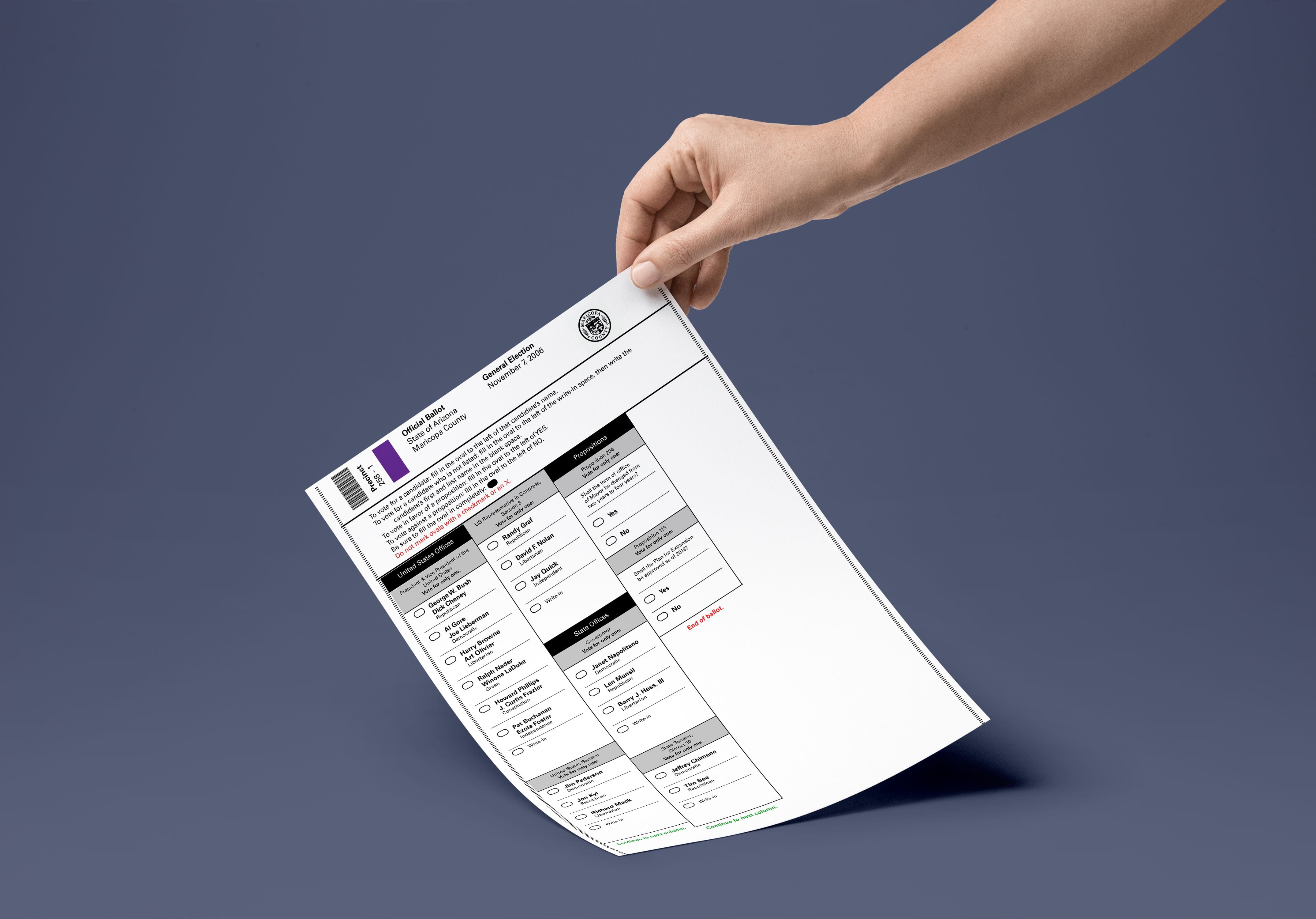
As a capstone project for the Graphic Information Technology degree at Arizona State, I researched paper electoral ballots for a case study on methods for more effective, accessible voting.
Focusing on pen-and-paper ballots rather than alternatives such as electronic or internet voting allowed me to step outside digital user experience design and consider more physical ways the UX discipline can improve usability.
Focusing on pen-and-paper ballots rather than alternatives such as electronic or internet voting allowed me to step outside digital user experience design and consider more physical ways the UX discipline can improve usability.
User Research
I conducted a cross-sectional survey of voting-aged Arizona citizens to get an idea of their opinions on what was difficult about voting for them.
Additionally, I had respondents rank-sort various voting schemes from the past such as checkboxes and bubbles.
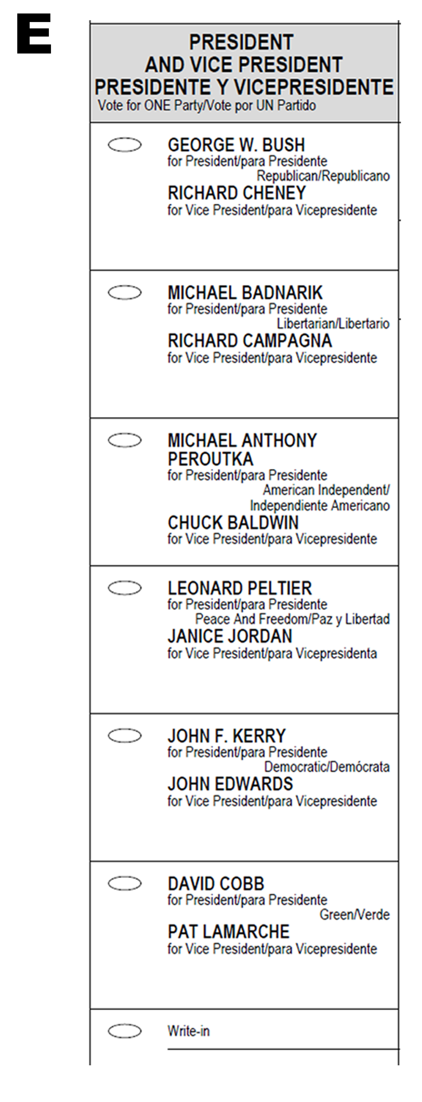
Clearer directions and improved legibility were highly desired, and checkboxes were the most popular format.


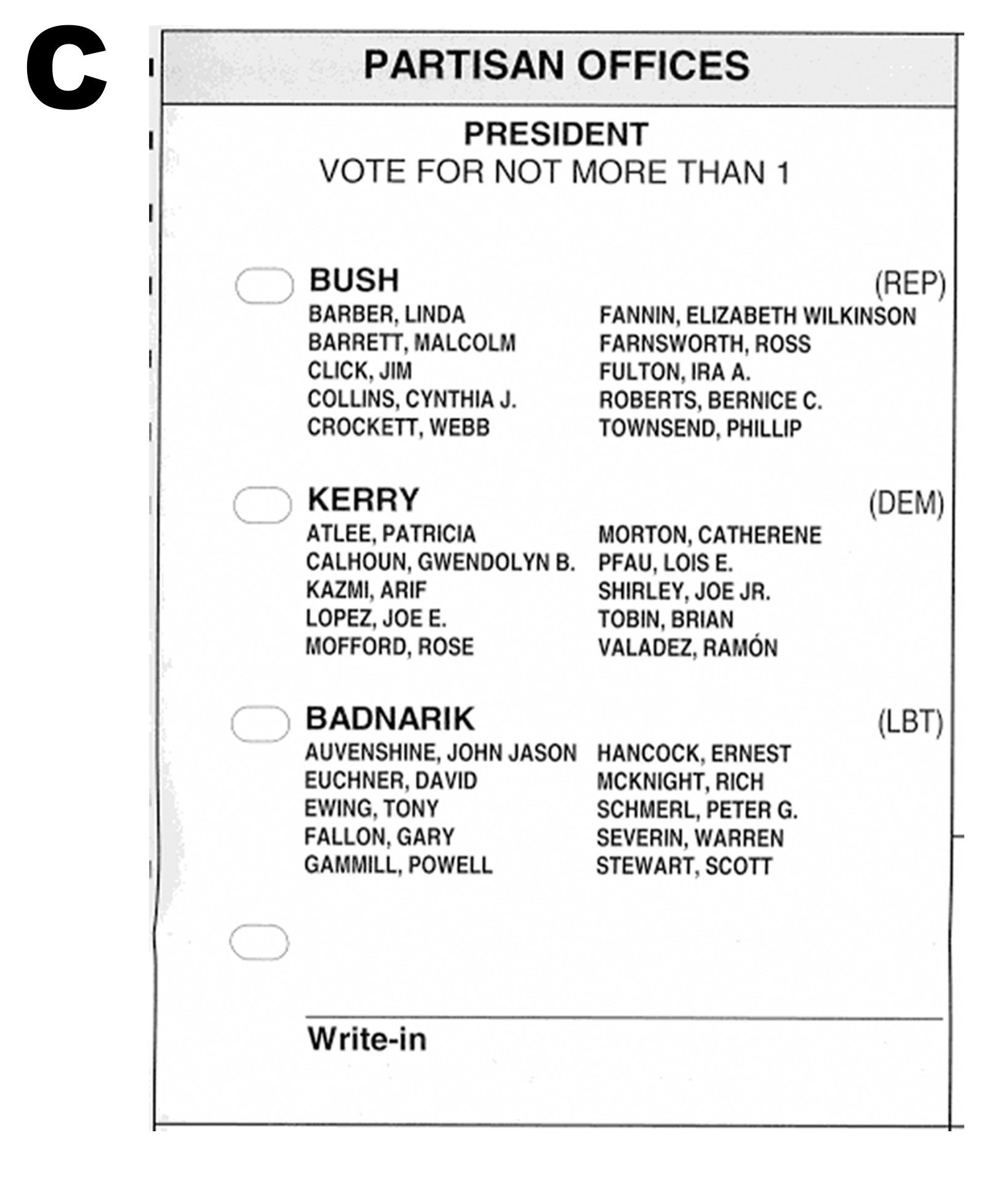

On-site Research
In order to understand the limits of printing and scanning paper ballots, I spoke with Kevin Runbeck of Runbeck Election Services︎︎︎, Maricopa County’s ballot provider.
I got an in-depth overview of the functions of the various markings found on current ballots and their purpose in sorting and aligning ballot sheets, which informed my final mockup.


Artifacts
My final submission includes a paper in which I recommended ballot best practices as informed by literature review, my original research, and in consideration of current printing and sorting techniques.
Read Whitepaper︎︎︎

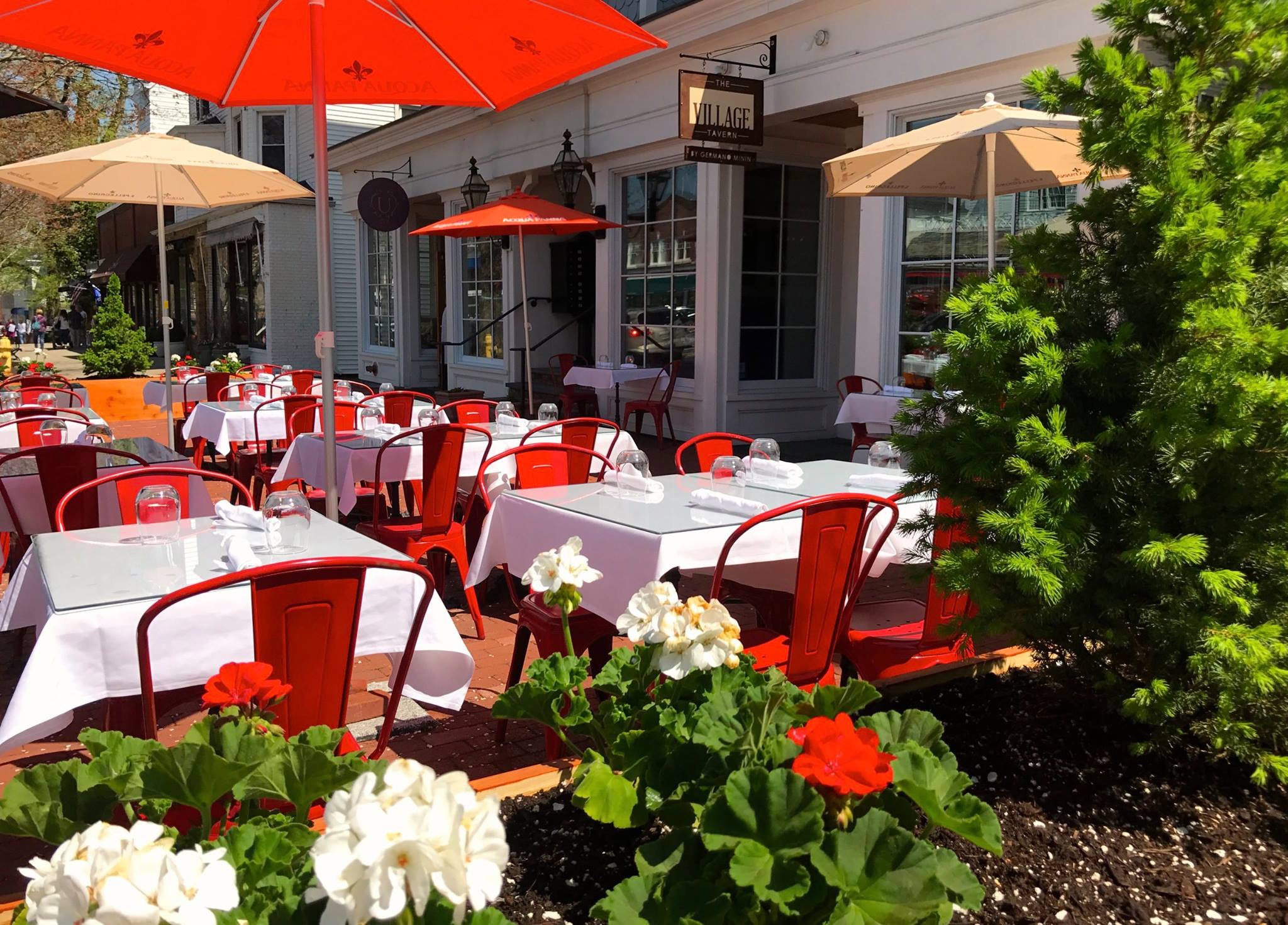
The Village Tavern
Freelance
2017
2017
Photoshop
Illustrator
InDesign
Illustrator
InDesign
HTML
CSS
JavaScript
CSS
JavaScript
The Village Tavern was
a new restaurant in Ridgefield, Connecticut serving New American food. I designed their branding, website, and physical collateral like menus, gift cards, and flyers. Additionally, I created most of their visual designs for social media.
Branding
While the logo was imporant for signage, the rest of the branding was mostly for social media and advertising purposes, as well as informing the website colors and type.

Menus
Made in InDesign, the menus feature a black and white four-column grid system for easy changes as well as a legend for specific diet restrictions.
This grid system was repurposed for various other items such as business cards, kids and special event menus, and gift cards.


Website
Since there wasn’t much dynamic content, I built the website in vanilla HTML to keep the site as small as possible — with no online features, its main purpose was directing diners to the location or providing contact information.


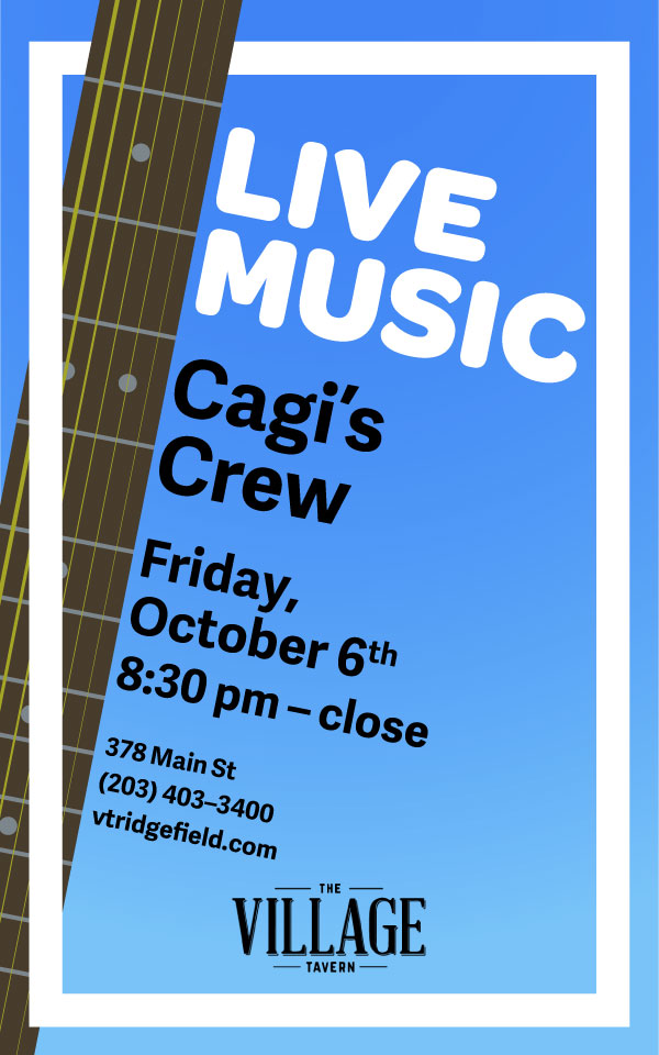
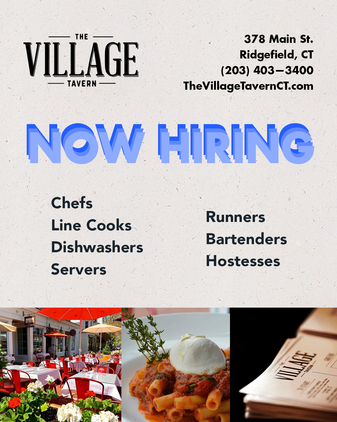
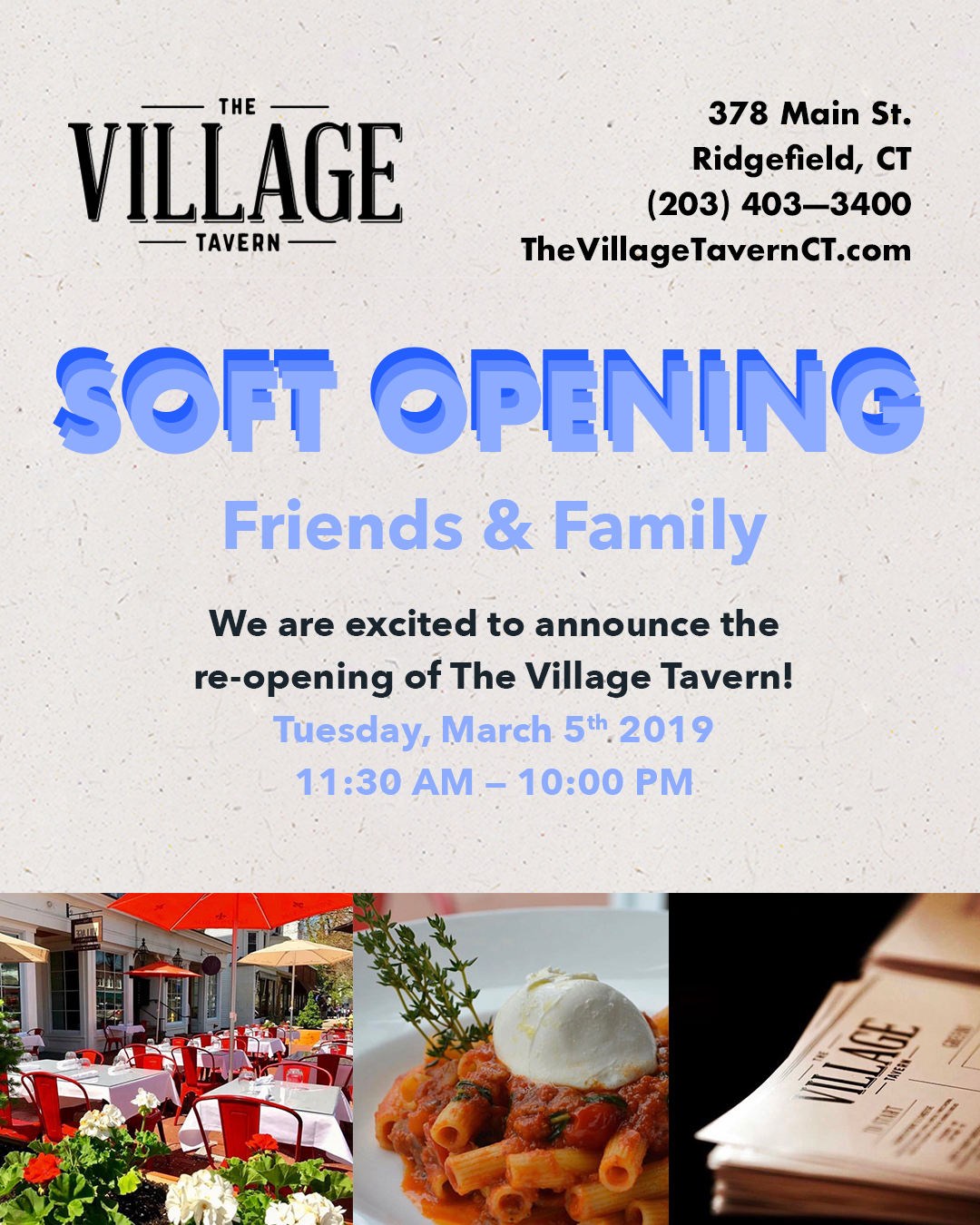
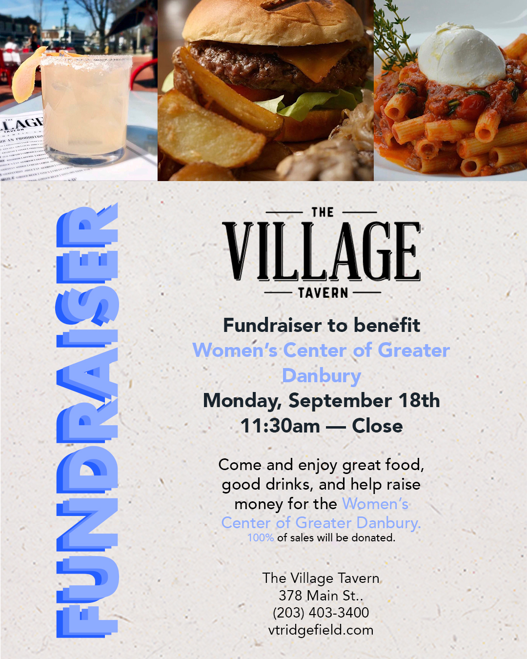
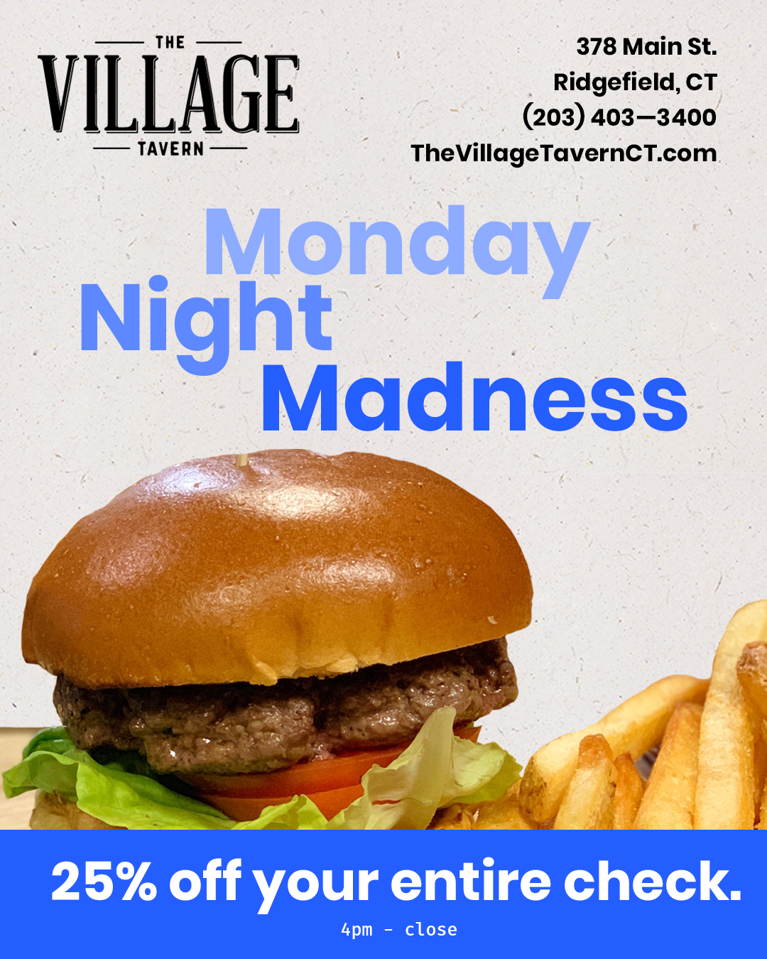
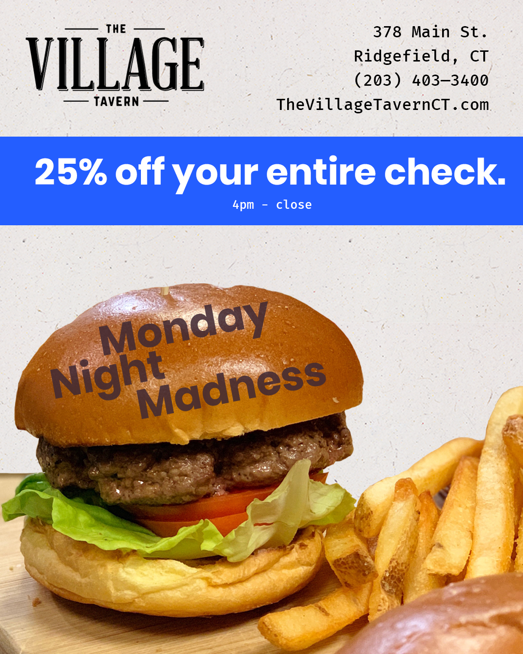
Social Media
The branding guide served as a system to keep posts on social media consistent and fairly quick to design.
While the information shared could vary from special events to notices, the consisten aesthetic meant it was always obvious to followers who the post was from.